
How does the World Bank classify countries by income?
author: ourworldindata/instagram, added on: 2025-09-21
ourworldindata:
When people talk about countries as “rich” or “poor”, they can mean many different things. But for researchers and policymakers, it helps to have a way to compare countries by income using clear criteria.
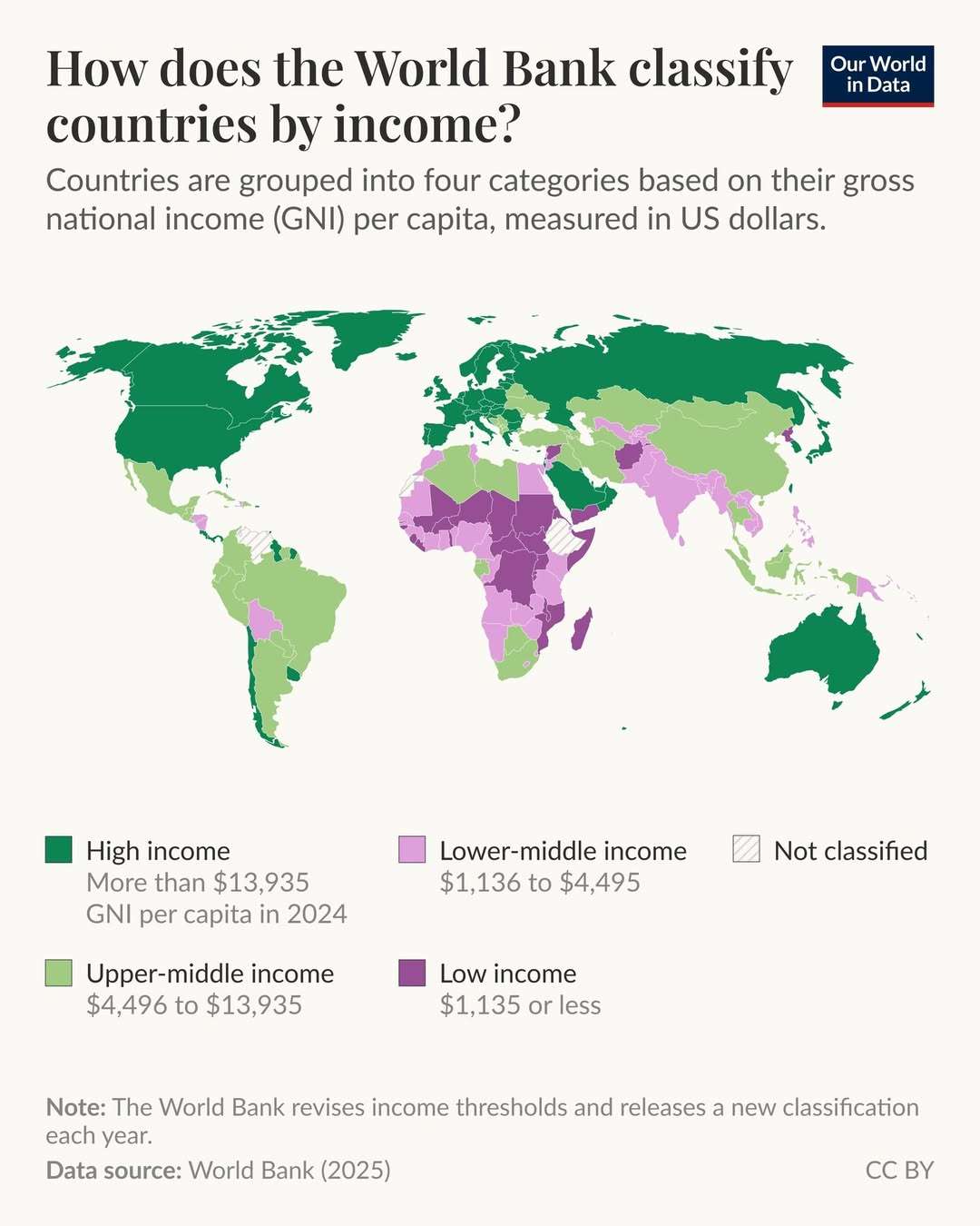
One widely used approach is the World Bank’s income classification system, which places countries into four groups: low, lower-middle, upper-middle, and high income. These groups are primarily intended for analytical and statistical purposes.
You can see the 2025 World Bank income group classification in the map.
On Our World in Data, we use the World Bank’s income groups in many of our charts, for example, to compare trends across low- and high-income countries.
You can see this for trends in annual CO2 emissions in the second image.
We always classify countries based on their income group in the latest World Bank classification at the time of creating or updating the chart. That grouping is then applied consistently across all years.
For example, in the chart, the data points for low-income countries refer to the same set of countries in 2023, 1980, 1940, and all years shown. This helps readers compare how indicators have changed over time for the same fixed set of countries.
🔗 Click the link in our bio to read our new article all about the World Bank’s income classification system — how countries are assigned to the groups, how the thresholds between groups are set and updated, some of the limitations of this classification, and how we use these groups at Our World in Data.
Data source: World Bank (2025); Global Carbon Budget (2024)
Collection: economics - Tags: development - Source: instagram.com